Understanding the Editorial Review Experience at DOAJ (2024)

Over the past few years, DOAJ’s journal applications have multiplied. Predatory journals, 50 form fields, all checked and double-checked before approval. DOAJ embarked on a five-month journey to redesign the Editors’ Open Access Journal review form to increase efficiency, completion and aid people’s decisions. Working alongside the Operations Manager, Editors and the development team, I set out to lead this research and prepare the ground for the next phase.
Methods: Mixed Methods (Interviews, Card Sorting, Surveys, Heatmaps, Usability Heuristics, Co-Design)
Tools: Dovetail, Hotjar, Optimal Workshop, Miro, Google Suite
Client: DOAJ (Directory of Open Access Journals)
Role: Lead UX Researcher
Duration
5 months
Inspiration
🧭 Context & Challenge
Imagine a person reviewing an academic journal using a form on one screen with over a clunky form, scrolling up and down 50 fields, 10 categories to find information, and browser tabs open on the other. That’s what the DOAJ editors faced daily, while publishers waited six months for an approval or rejection.
I planned my research in collaboration with the Operations Manager and the Managing Editor (timelines, recruitment, scheduling). I also engaged the UI Designer and the Developer throughout the UCD process to maintain collaborative relationships.
🎯 Research Goals
Identify usability issues, measure form entry completion
Understand editors’ workflows across roles (Triage, Editor, Managing Editor)
Surface opportunities to aid people’s decisions
Five methods were planned to answer the objectives, involving a total of 65 participants from 10 geographies, 3 groups, and 8 languages, with a mix of experience, age, sex, and educational background. The main qualitative methods revealed people’s workflow and mental models, while the secondary qualitative studies triangulated the main.
🔬 Methods, participants and their Purpose
-
6 editors from peer organisations - Looking further afield for inspiration and usability ranking.
We conducted six comparative interviews. We then rated forms based on their adherence criteria, such as Form, features, manual processes, satisfaction, usability, and clarity of the form architecture. Last, we synthesised notable forms into a collage to identify unique opportunities and inspire the design process.
-
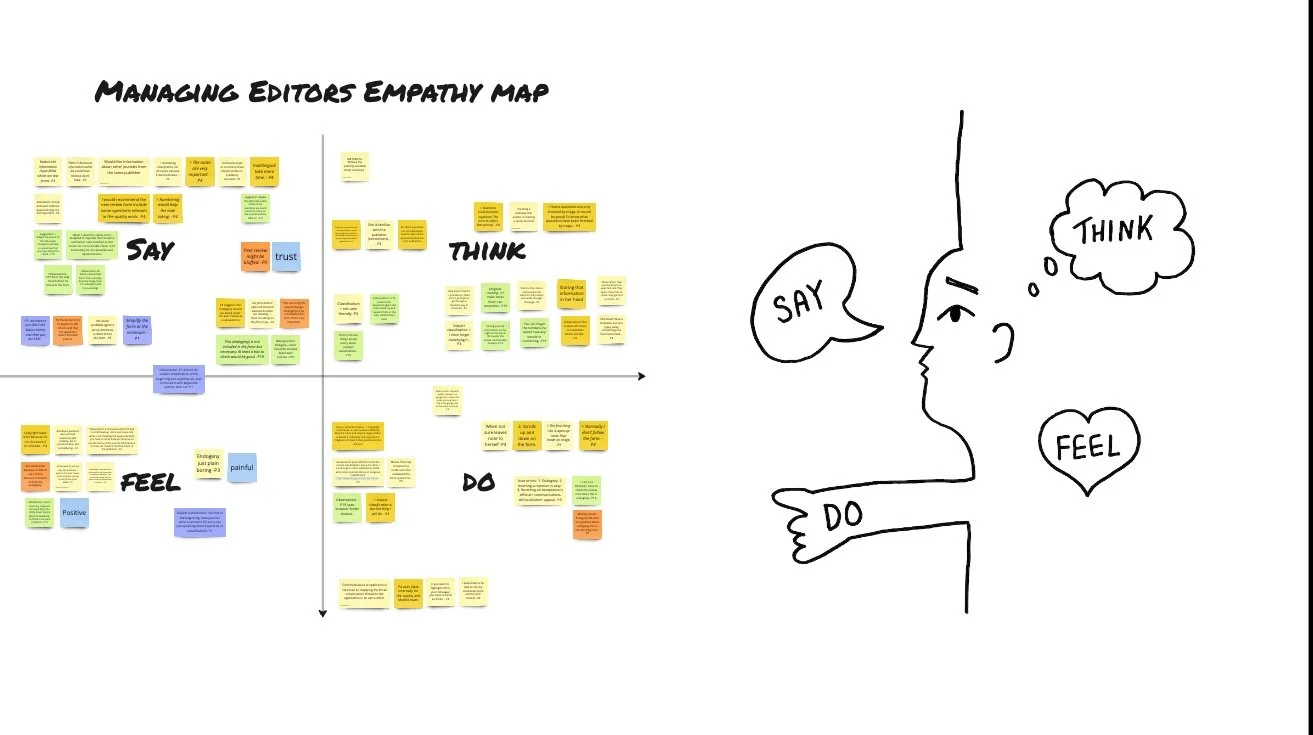
16 DOAJ editors (4 roles) - Understand people’s ways of working.
We first asked people to walk us through completing a new review form and observed their behaviours and challenges.
We then organised observations and highlighted quotes into common themes and insights based on what people say, do, think, and feel, forming an empathy map per role.
-
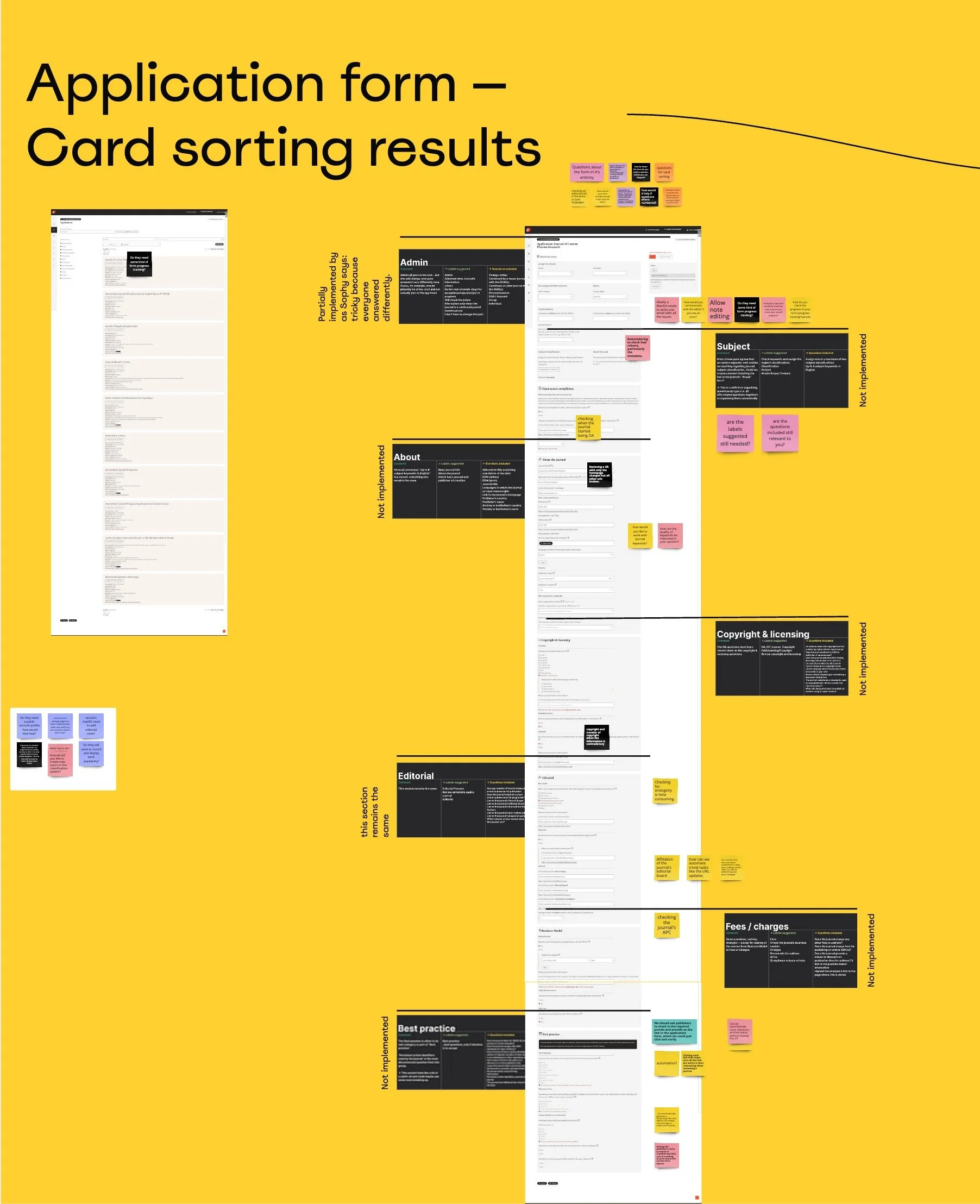
17 editors | Evaluate and update previous study, surface mental models |
To understand how people group questions to inform the form architecture. Let's call this area Information Architecture (IA).
Quantitative data was synthesised into visualisations showing where each Editor group categorised the Form questions related to their role..
-
4 editors | Validate key themes and supplement interview findings. The data was summarised into three key themes and opportunities.
In parallel to the above, an unmoderated conversational AI survey complemented the main reaching out to non-interviewed editors.
-
1 year of HotJar data | looking at recorded screen behaviours matching interviews.
Heat maps, quantitative data, and user videos collected over the last year were reviewed for patterns of clicks, scrolling, common behaviours of form visibility, average timings on the form page, and device usage.


Ideation
As I analysed each set of data using an affinity diagram, patterns began to emerge. Four out of six institutions set mandatory criteria to define acceptance and secondary ones to score public publishers. More so, the way DOAJ editors categorised questions during card-sorting reinforced this finding. The survey also aligned too.
The data revealed that the way DOAJ prioritises criteria moulds their application and the review forms. Publishers comply, and editors score and approve with confidence.
Last, we found that 50% of people do not scroll down past the Continuations section; instead, they press the Quick Reject button. From the interviews, I found a correlation with errors message behaviours. Namely, Editors prefer to reject a paper, rather than to make an irreversible mistake, which sets the publishers’ waiting time a further six months! These insights would not be apparent without the research rigour of data triangulation.
Co-design Workshop
I find work most rewarding when I can transform stakeholders’ challenges into design solutions through their expertise.
For this reason, I invited all stakeholders to a workshop and presented collected data and empathy maps. This allowed them to connect with editors’ challenges before they ideated and prioritised features. They then collaboratively grouped IA categories into each Editor workflow, sketched solutions, and communicated their rationale to the group. The outputs nudged the team’s positive mindset and camaraderie, giving me feedback on how useful the experience was for their understanding of how the artefacts can feed into the design phase.
Four design artefacts resulted from the workshop:
- a collage of platforms,
- 3 personas,
- their workflows, and
- a set of five sketches to inform the design phase.
We also agreed on four more insights to merge personas, create a new one, and eliminate duplications in their workflow, inspiring stakeholders to continue exploring.
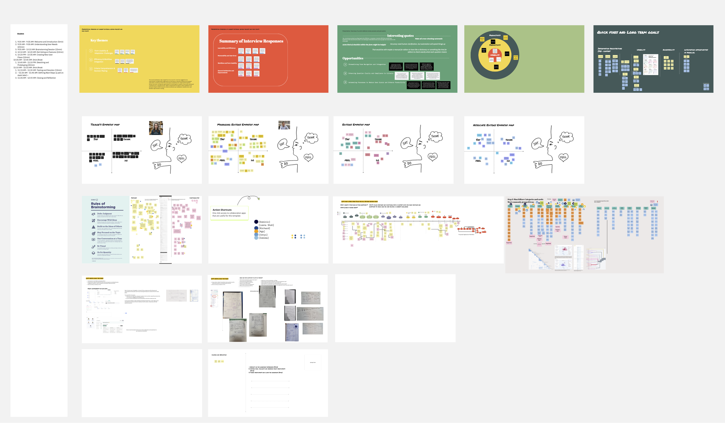
Four empathy maps

Personas
Prioritised features and functionalities such as: - Tabbed interface - Progress indicators and - Auto-filled or automated fields (e.g. Classification, Endogeny).

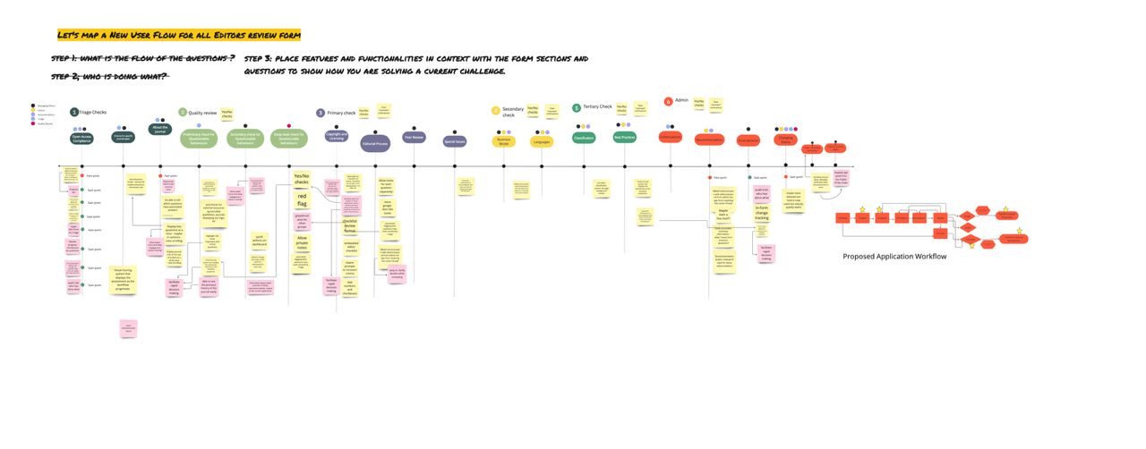
A user flow per persona- illustrating each persona's responsibilities and duplicate checks..
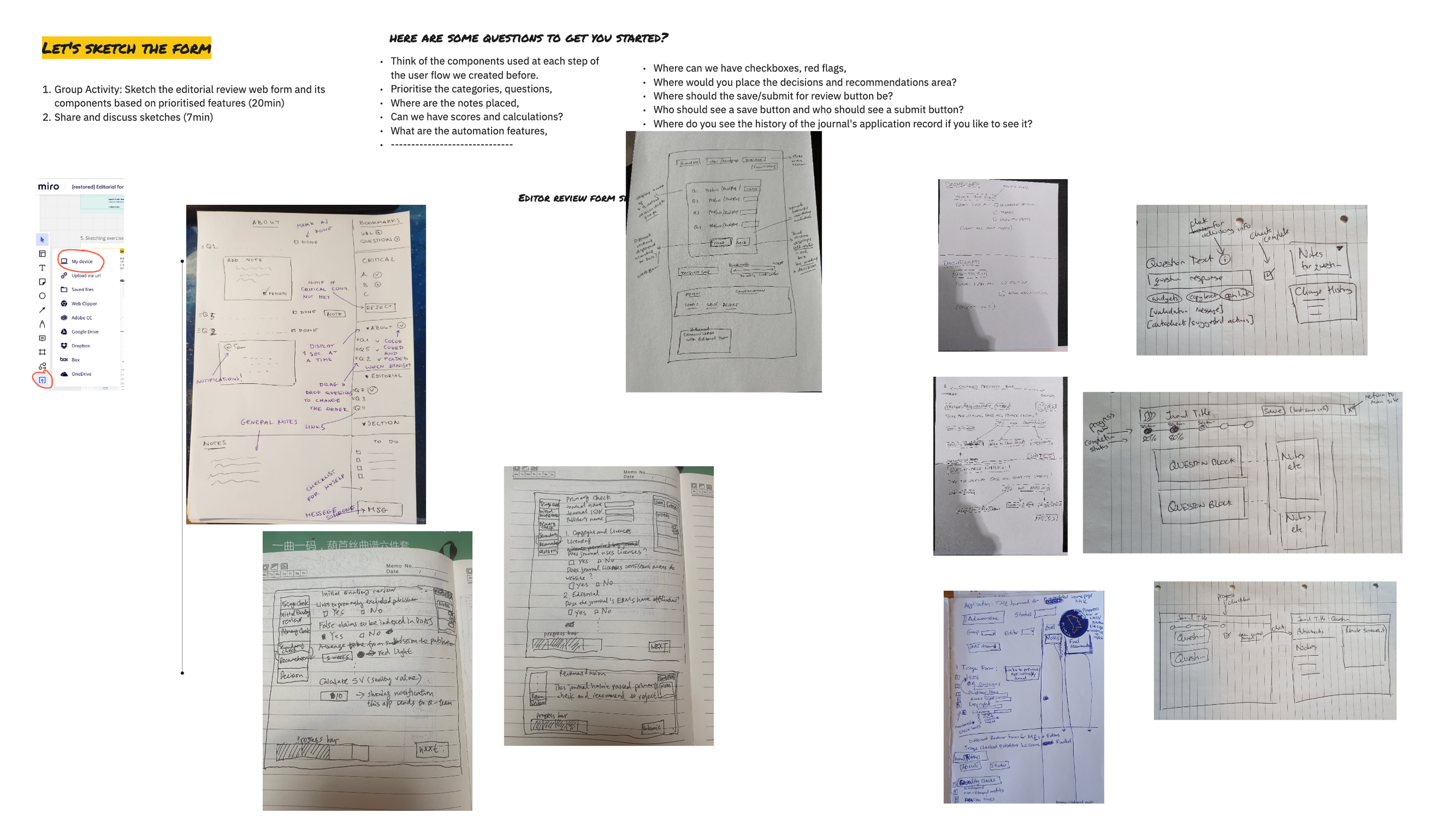
Five paper sketched future forms- including features and functions.
Implementation
The implemented form IA adapts to each Editor workflow. Re-distributed categories correspond to the Editor’s level of responsibility, eliminating duplication. Autofilled parts reduce errors and time, and progress bar visualisations give a sense of confidence, motivation and achievement, aiding people’s decisions.
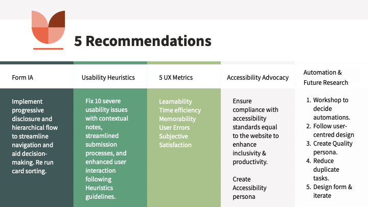
Five themes of insights
Instead, I reported on five themes of insights with design recommendations and next steps.
1. Form Information structure or Architecture (IA),
2. 10 Usability heuristics with quick fixes
3. Five UX metrics benchmarked,
4. Form Accessibility Advocacy (WAI & W3C) and
5. Automation Opportunities
Outcomes
In this study, we set out to identify usability issues, update Editors’ workflows across their roles and finally to surface opportunities aiding people’s decisions.
When every form field and criterion competes for primacy, nothing moves forward. DOAJ has to prioritise its criteria.
Five themes of insights were documented, presented and paired with actionable design recommendations tailored to each stakeholder group (editors, developers, designers). A Q&A session followed to foster communication and dialogue. 10 usability issues were identified, and a heuristic review measured their severity to help developers prioritise their tasks. 5 UX Metrics give direction on how to improve form, and an accessibility audit was conducted to help developers align with DOAJ’s core values.
- The archive in Dovetail sets the ground for Research Operations.
- The documentation in G. Suite and continuous systemic research.
- The implemented form IA adapts to each Editor workflow.
- Re-distributed categories correspond to the Editor's level of responsibility, eliminating duplication.
- Autofilled parts reduce errors and time, and progress bar visualisations give a sense of confidence, motivation and achievement, aiding people’s decisions. the aggregated workflow sets the backbone for the service design blueprint, allowing the organisation to clip prior and meta steps to overview the journal application and review process as they are conduit processes under DOAJ’s criteria.
🧭 Reflection
Through the team’s collaboration and openness, we built shared understanding, surfaced needs between geographies, and co-created solutions. The supporting artefacts are the building blocks for any future research and design that DOAJ will need.
“When we care, we go beyond any brief…when users feel heard they are more forgiving”
Similarly, I was humbled by volunteer editors’ availability across time zones to speak to DOAJ management, echoing of D Norman, IDEO and Stickdorn & Schneider’s book on Service Design Thinking.
People don’t mind problems if they feel heard.
The outcomes ensure the next steps can be grounded in user research, giving DOAJ a roadmap and a competitive advantage through user advocacy.