
Three- A/B Testing & Information Architecture
Three is the cheapest provider in the UK, and they wanted to promote that fact, by elevating user engagement. I was tasked to provide a fresh design concept on the PAYG price comparison page. This page contained static tabular information and needed to be re-designed into interactive user experience, helping the user to decide which provider to choose for their needs.
Understand.
Three is the cheapest provider in the UK, and they wanted to promote that fact, by elevating user engagement. I was tasked to provide a fresh design concept on the PAYG price comparison page. This page contained static tabular information and needed to be re-designed into interactive user experience, helping the user to decide which provider to choose for their needs.
Creating tabular data for mobile technologies was not an easy task. I looked to see other work in the industry through desktop research on comparison tables for mobile. Following that, I developed a comparative analysis and shared the findings back to the agile team for feedback and discussion.

Create.
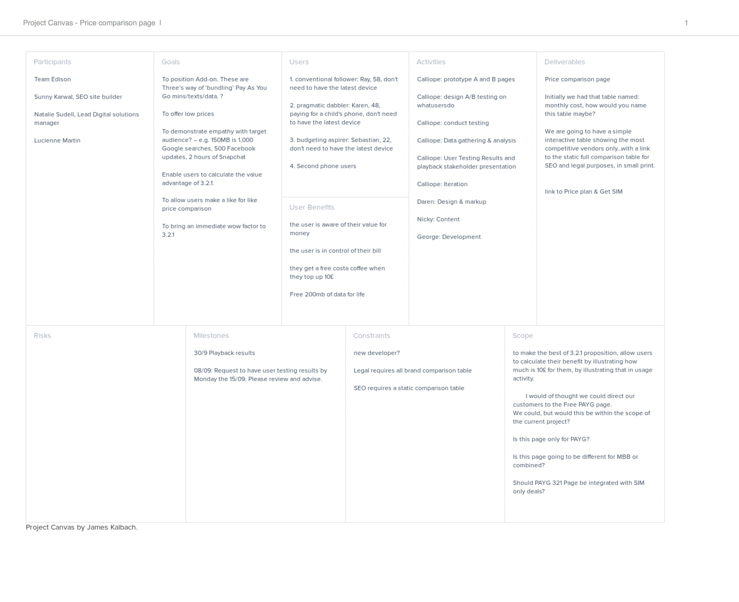
I designed and facilitated a Participatory Design Workshop inviting my team and the project stakeholders, to present my findings and sketch the concept and its components together. I split the team into two groups, and following a rapid prototyping session, they outlined and advocated their ideas. I helped the teams to vote for the most common components and most feasible to make; then we sketched an iteration with each group into one coherent prototype.
Two design concepts were created using Axure. These included interactive sliders dynamically changing the table values and recalculating the amount from pence to pounds, to illustrate the evolution of values. The next step was to conduct an A/B user testing to validate the teams' assumptions.
I arranged a pilot testing and moderated the session to allow the stakeholders to have a first-hand experience of the UX process. Following that, I gathered the information, transcribed and analysed the findings in thematic analysis, in a bottom-up data approach. Like this, I informed the prototypes. The users found the slider changing values more intuitive, interactive and engaging than the static table formerly displayed. Due to the proximity of preferences, I recommended that the previous page in IA, the store page, should provide two calls to actions (CTA's), to aid the users' decision-making process.
Tasks
Project Canvas
Personas update
Participatory design workshop
Design Thinking for mobile-first
Axure wireframe design
User testing plan and documentation
Corridor testing A/B prototypes
Data Gathering and Analysis

Deliver.
Unlike the stakeholder's team's assumption, the user testing results revealed that 60% of users preferred page B
"How much do I get for my £20?" over 40% of users who preferred page A, "how many minutes, text, data do I want?".
This project resulted in taking a new approach when designing tabular data interactions for mobile design.